
Images Of The Dallas Mavericks’ 2019-2020 City Edition Unis Have Leaked — And, Holy Hell, Can This Team Please Hire New Graphic Designers?
Listen: It’s an objectively great time to be a Dallas Mavericks fan at the moment.
On the back of the undeniably great (and himself quite fashionable) Luka Doncic and the still-not-all-the-way-back-in-the-swing-of-things Kristaps Porzingis, this year’s team is looking like a playoff contender — and about a year or two ahead of schedule per most pundits’ preseason expectations.
Best of all, though, this team is just fun. (Also: Not for nothing, but there’s even a lot to like about the new leadership the team has put in charge on its non-basketball operations in the wake of its workplace misconduct scandal that came to light in early 2018.)
Still, as we’ve been saying around these parts for a while now, the team’s uniform situation leaves a lot to be desired. And, rather unfortunately, it doesn’t look like any improvements are coming in the immediate future. Actually, it’s quite the opposite!
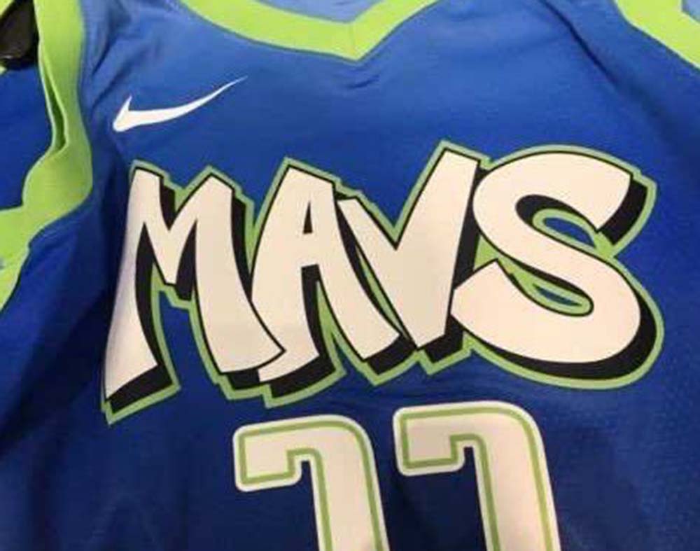
Over the course of the last few days, Mavericks Twitter has been abuzz with leaked images from retailers who’ve been getting ready to roll out the team’s 2019-2020 City Edition jerseys for sales purposes. Impossibly, this year’s option is — just as feared based on early leaks of the team’s City Edition court design — somehow even worse than the eyesore alternates the team has churned out of late.
Seriously, just look at the horrifying leaked image that started all the concern earlier this week:
Yeeeeeeeeeeeeeeeeeeeeeeeeeeeeesh.
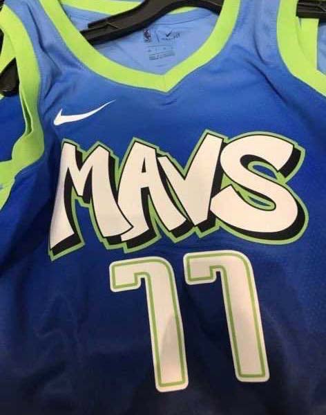
Lest you doubt the above image’s veracity, here are some other tweeted-out images that put the Mavericks’ 2019-2020 City Edition branding plans into larger scope and pretty much confirm its direction:
— MavsMania (@MavsMania23) November 13, 2019
Look what @ahsanm24 spotted at Lids…
Mavs new city edition hat with the gradient they’re using for the uniforms 👀 #LeakSzn #MFFL pic.twitter.com/pzd4LFOr0a
— ⚛️ (@TylerAtoms) November 9, 2019
Ostensibly somehow inspired by Deep Ellum (?), these designs — as many others have noted — look like some lazy The Fresh Prince of Bel-Air-inspired knockoffs. They’re like what some entirely white and suburban graphic design department from 1991’s interpretation of what “a hip-hop look” would be. They’re just bad — and that’s before even considering how the number and name fonts directly clash with the graffiti-like team name font selection.
Folks, this shit is maddening. After quietly rolling out a rather straightforward, but otherwise honestly solid, new “statement” alternative jersey at the start of this season, the team wants to regress to this bullshit? Ugh. Honestly, the court design leaks should’ve given us all plenty of time to mentally prepare for this look’s inevitable disappointment, but this blow doesn’t feel softened by the wait.
Nope.
Not at all.
Not even in the slightest.
With all the great fan-designed options out there, this is what this team gets?
Come. On.
This continued missing of the boat is, literally, a bad look.
In no uncertain terms: Luka deserves better.