Graphic Designers Have Been Sharing New Uniform Concepts For The New-Look Mavs On Social Media, And We Prefer Them All To What The Team’s Currently Got.
It’s been more than five months since the Dallas Mavericks’ corrosive corporate environment became national news, and 125 days since the team hired new leadership and promised to embark on a 100-day plan to “address and improve the culture of the organization.”
At this point, though, the only notable institutional change that the NBA franchise has formally announced is a plan for its dance team to both dress and dance less provocatively in the upcoming season.
Hmmmm.
Unfortunately, that lone reveal has appeased neither those demanding corporate restructuring from the team nor the uniform junkies who have in recent years repeatedly cried for the actual players on the basketball team to don new duds of their own.
Earlier this summer, the chorus that’s been blasting, well, pretty much most Mavericks jersey throughout history as being “boring and uninspired” for pretty much forever started to grow thanks to increased media support of the matter. First, in an open letter penned to team owner Mark Cuban, Dallas Morning News architecture critic Mark Lamster suggested that ownership “reset the direction of the franchise” and engage in an all-out “design reboot,” now that it has a new potential face of the franchise in its exciting, 19-year-old first-round draft pick Luka Doncic and now that the team has also finally signed its first marquee free agent sign in seemingly forever in DeAndre Jordan. A few days later, Dick Sullivan at Mavs Moneyball basically made the same case, focusing specifically on the need for the team to choose a new logo for this new, impending era.
This is a notion that the more design-oriented fans of the team have also fully embraced, with at least three four graphic designers taking a page (albeit unprompted) out of the team’s own crowd-sourced design-loving playbook to recently share on social media their own visions for the Dallas Mavericks’ sartorial future.
It’s objectively neat to check out how each of these designs independently nods to the team’s aesthetic pasts while also adding in signature elements that also keep an eye toward the team’s suddenly exciting again future. Beyond that, we also just really dig what these designers are putting out there as they’re all leaps and bounds better than what the team’s currently rocking:
[Shivers with disgust.]
Anyway, let’s take a gander at these way better fan-generated designs and try to convince the Mavericks to move forward with, honestly, any single one of these vastly improved concepts over their current ones.
After all, other NBA teams are tinkering with their looks this off-season. So why can’t the Mavs?
@SkylerInDallas
A Twitter user who calls himself an artist, a designer, a photographer, a cyclist and, um, a Dirk first shared his take on the Mavs’ visual future on Monday, July 9. His mostly straightforward — and refreshingly clean — design concept for new Mavericks uniforms. Even with his most out-there concept — a Triple D-referencing alternate jersey — each of Skyler’s designs stand as a testament to the notion that less is indeed more. Also a big plus? All of these designs appear to be imminently wearable in on- and off-court settings alike.
![]()
![]()
![]()
![]()
![]()
Seth Reese
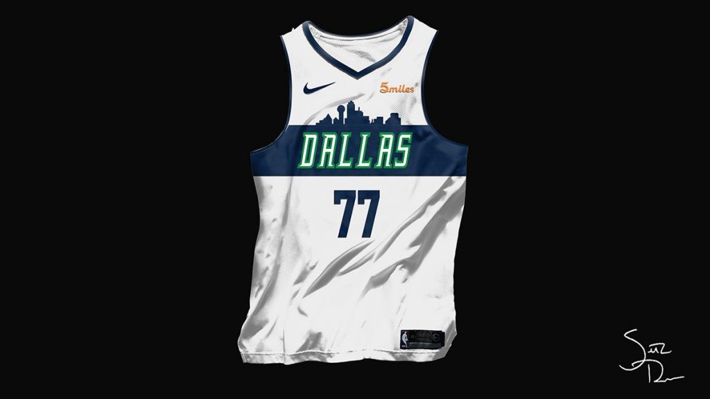
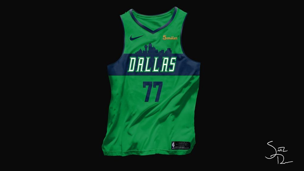
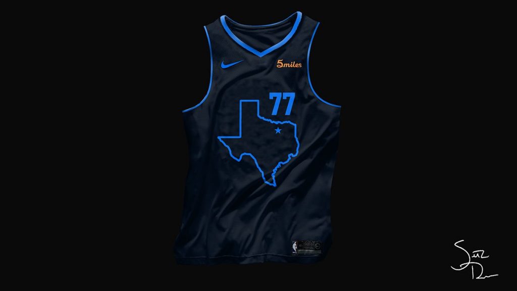
Just three days after Skyler shared his uniforms to much fanfare, the Cincinnati-based musician Seth Reese shared his take on a new Mavericks uniform design. Unlike Skyler’s designs, which included the Dallas skyline only as part of an alternate option, Reese’s offering finds Dallas’ cityscape integrated into a cross-chest stripe on his looks’ main home and away jerseys. His most striking design, however, is his own alternate suggestion — a word-less, navy concept built around an outline of the State of Texas, with a star located where Dallas sits. All other team branding in that design is implied rather than stuffed down everyone’s throats. It’s a bold, and beautiful, choice.
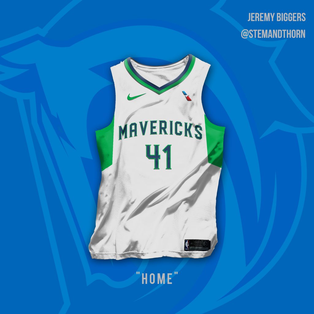
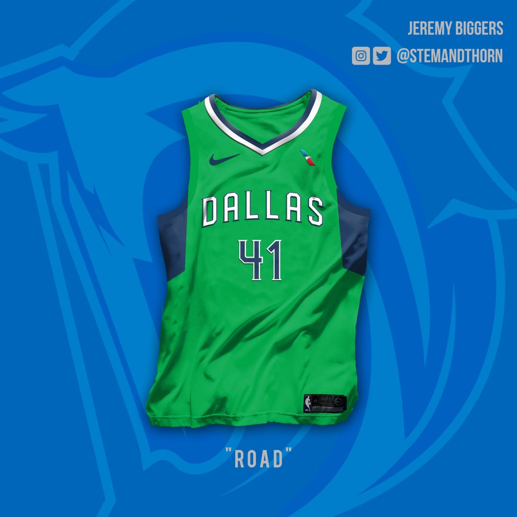
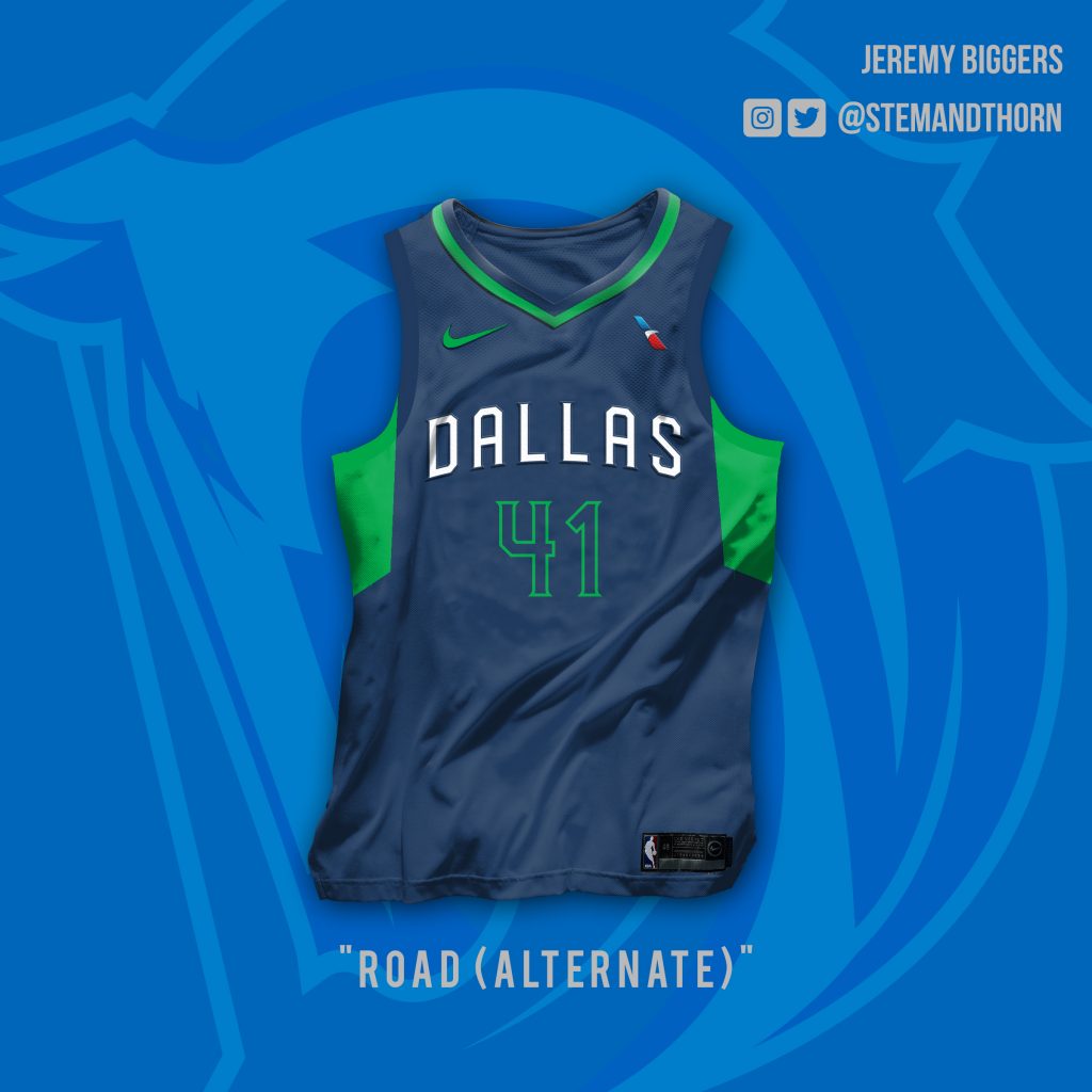
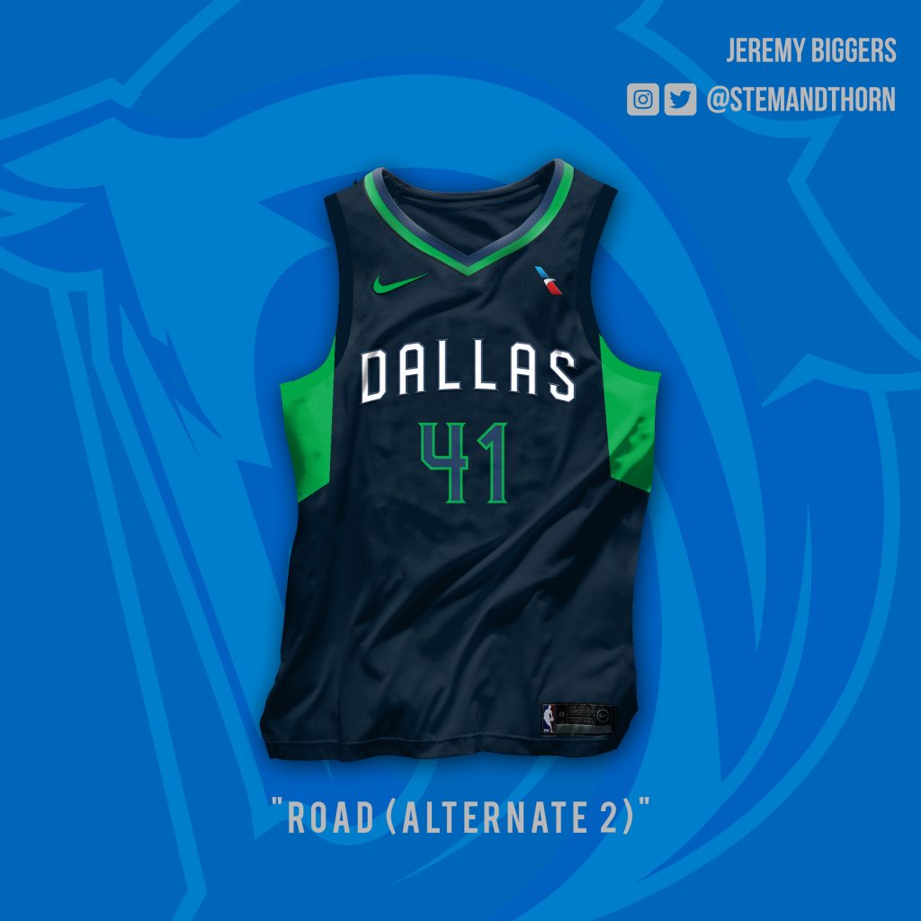
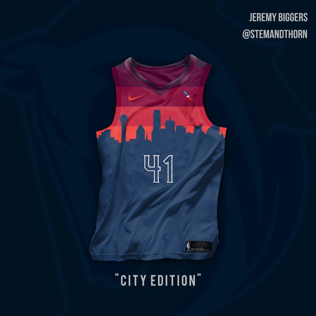
Jeremy Biggers
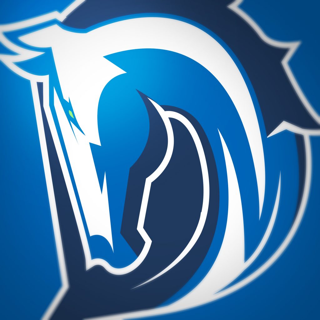
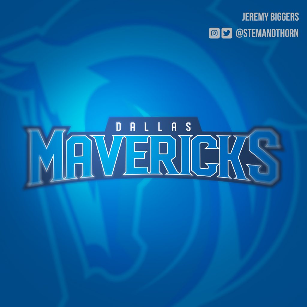
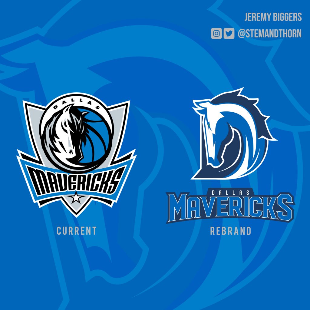
We’ve gushed plenty over the years about Dallas creative Jeremy Biggers’ undeniable visual talents across various mediums, and his own just-released vision for a future Dallas Mavericks look is of the same high quality we’ve come to expect from the man. Of course, his effort also takes things the farthest of all the social media-shared designs we’ve yet seen: In addition to new unis for the team, Biggers has completed an all-out re-branding for the team, down to its logo and even its typeface. The logo, which updates the team’s current horse-based design into a more tradition letter-based shape, is particularly sharp, not to mentioned begging to be placed onto a ball cap. And, as is apparently par for this Mavs uni redesign course, Biggers’ most daring step is also his most eye-catching, as his take on a “City Edition” uniform introduces an entirely alternate colorway into its design and ditches all verbiage. Writes Biggers of that choice: “The skyline never looks better than during a sunrise/sunset so I made the decision to do away with the limitations of staying within the team colors… the Dallas skyline is so iconic and well known I also decided not to include any text and let the skyline speak for itself.” We’d say his designs speak for themselves, too.
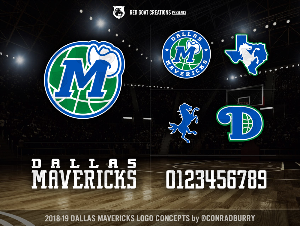
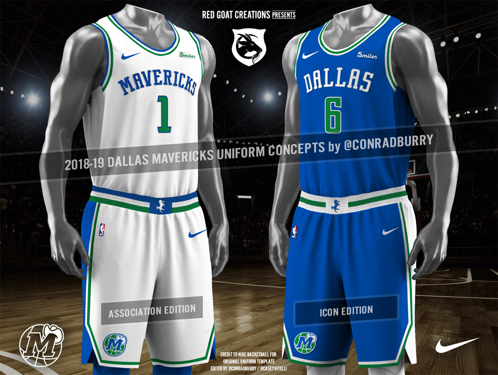
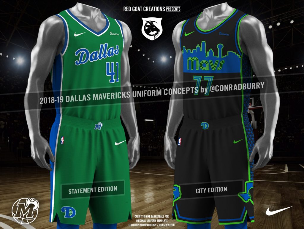
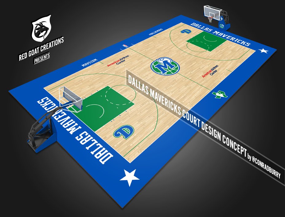
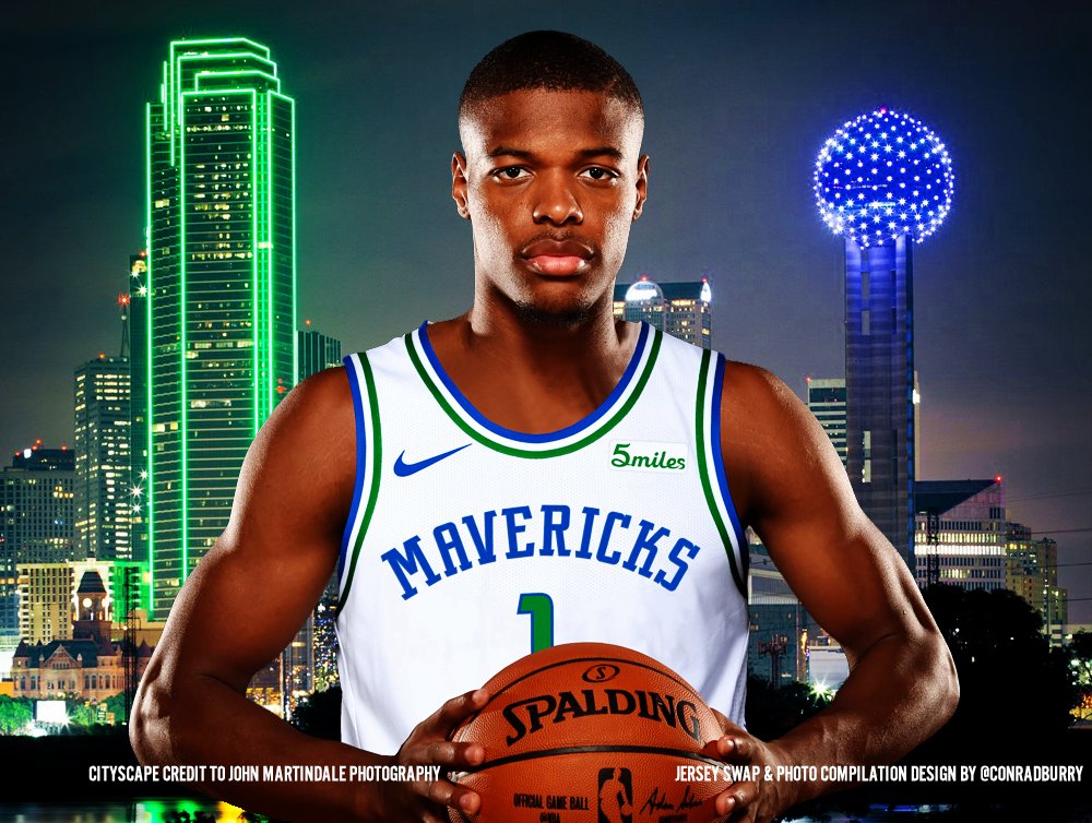
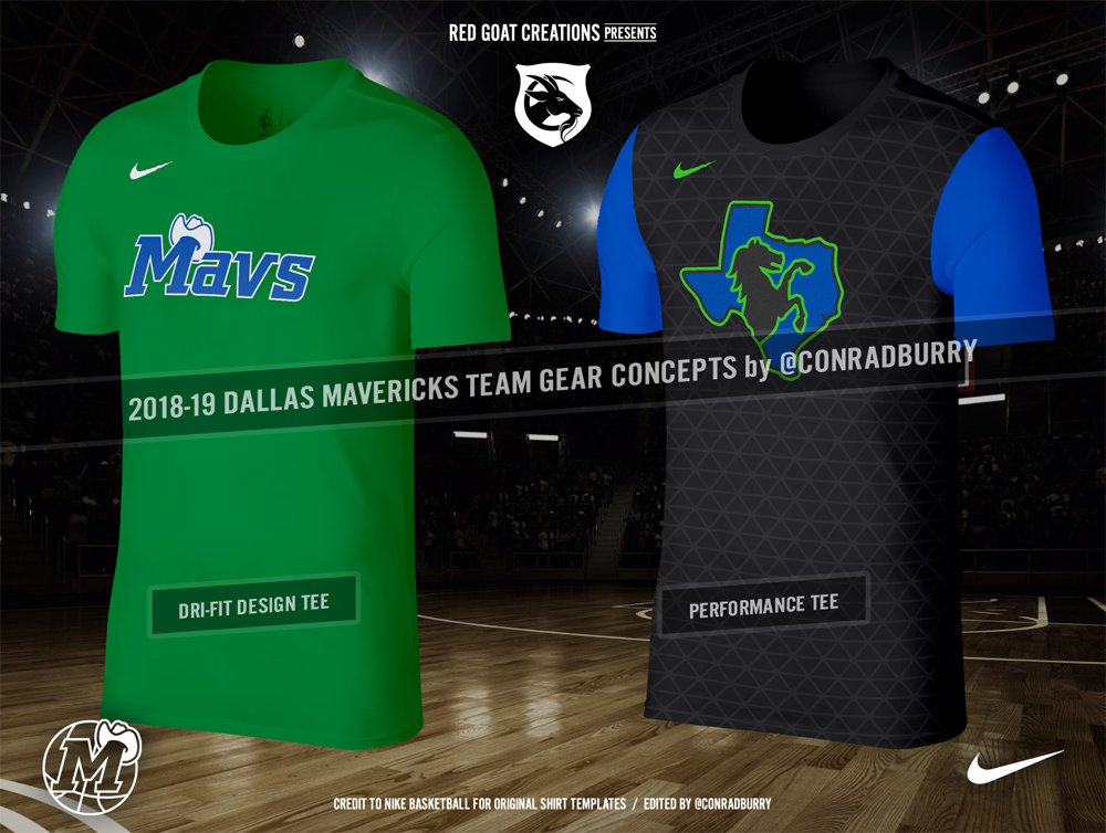
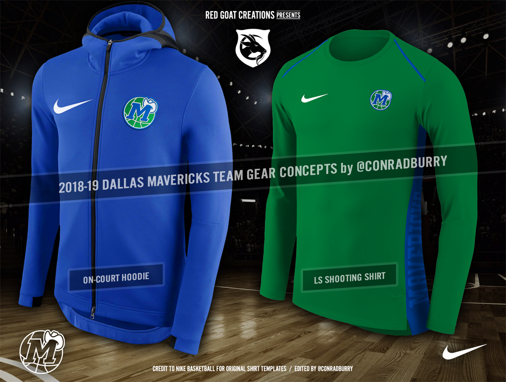
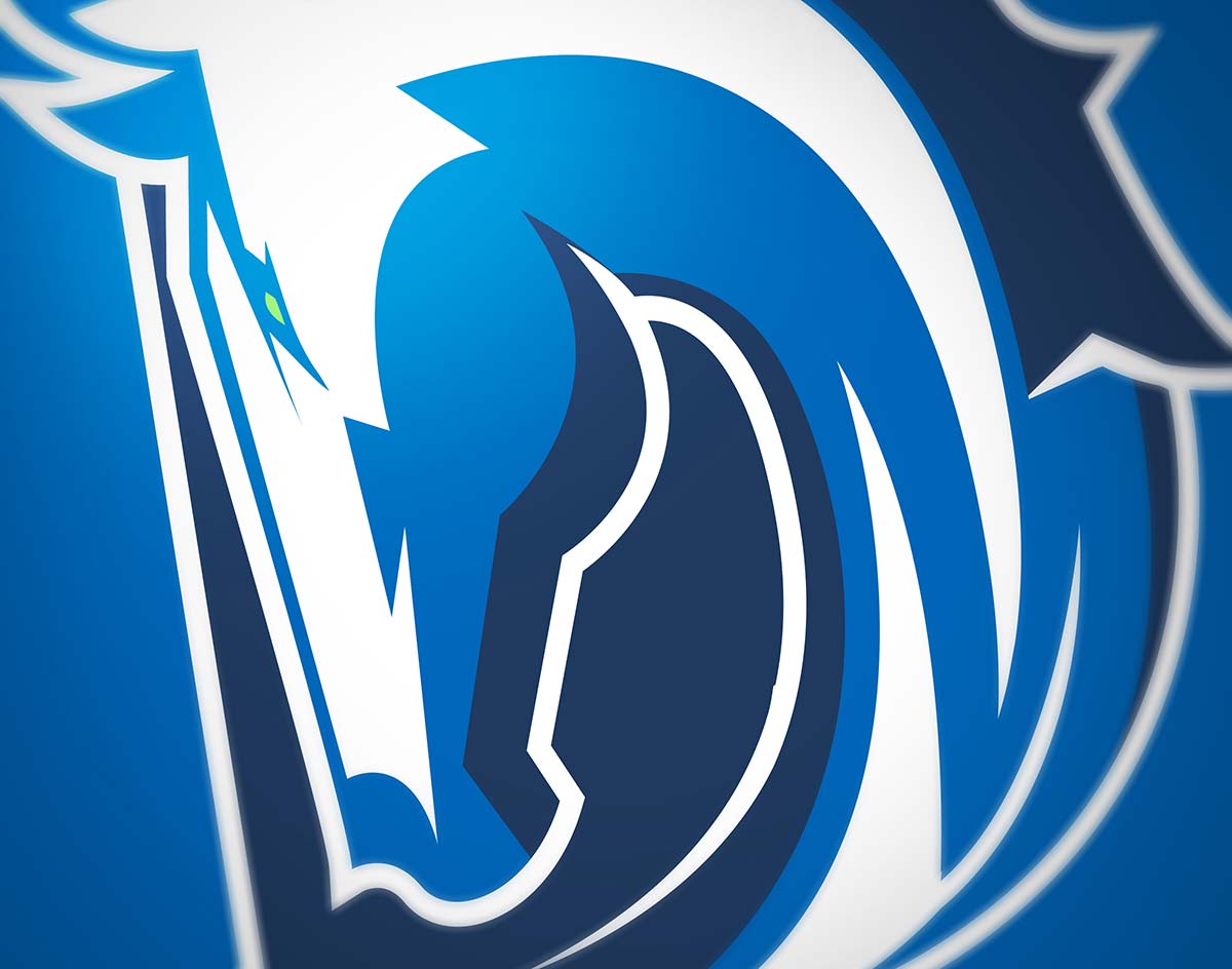
Conrad Burry
The graphic designer behind Red Goat Creations — who is also a contributor to a website dedicated to sports logo and uniform design news — would upload his ideas for both new uniforms and team logos on July 24. But why stop there? Dude also re-branded the entire damn franchise, all the way down to its font and even the team’s home court design. His is a mostly retro-themed design that updates the Mavericks’ old cowboy hat-themed design and takes it in some new and exciting, but still recognizable, directions. Especially interesting is his alternate horse logo, which is looks like it exists at the center of a Venn diagram featuring the old Denver Broncos logo, the Detroit Lions logo and the Southern Methodist University logo.