
From Timeless Classics To Uniforms That Look Like The Trash Bags They Belong In, These Are The All-Time Best And Worst Looks Of Dallas-Area Sports Teams.
By now, we’ve all seen those dreadful new Dallas Mavericks City Edition jerseys — the ones that look like they were designed by a fortysomething who’d heard about the 1990s but somehow managed to never actually live in them.
Yes, these ones:
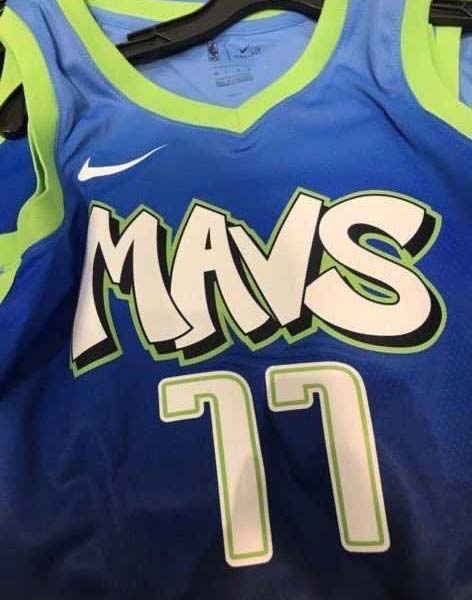
Nope, they’re not great!
Of course, as much enjoyment as we get from dunking on the Mavs’ poor sartorial and design choices throughout the years, it should be said that our professional basketball franchise isn’t the only offender when it comes to sports teams around these parts just severely missing the mark on the fashion front.
At the same time, we should also point out that there have been some truly great uniforms worn by our area athletic organization at certain points, too.
In this post, we aim to highlight both — the good and the bad — by attempting to identify the best and worst uniforms that each of our region’s teams have worn throughout the years.
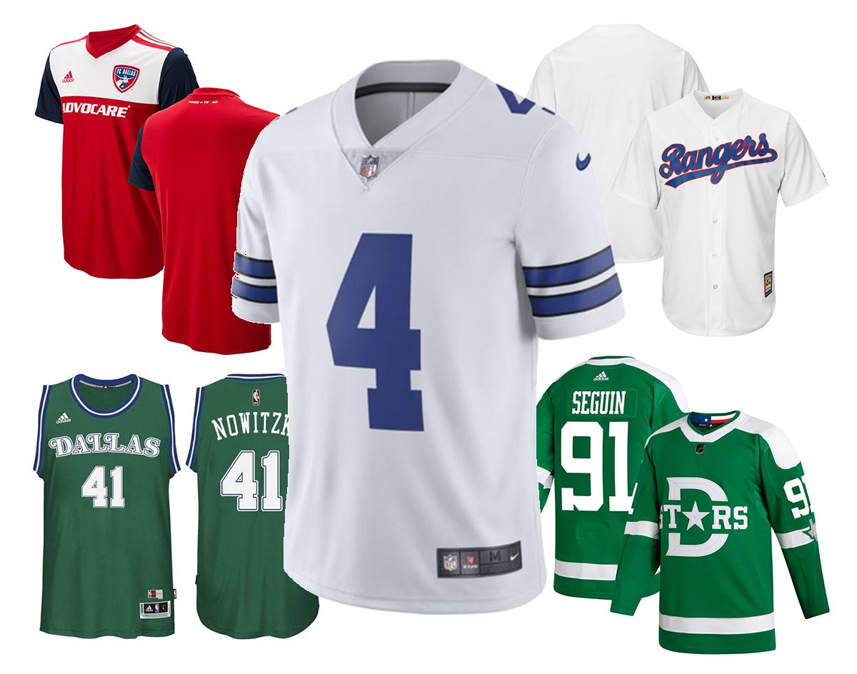
Dallas Mavericks
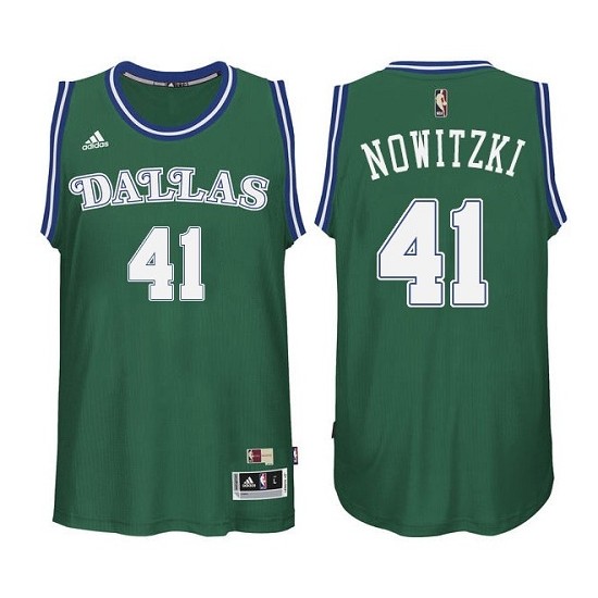
THE BEST: The Dallas Mavericks’ throwback green jerseys, most recently seen in the 2015-2016 season, are so adored that they’ve even inspired an entire group of people on Twitter to start up a #GreenItBack campaign in hopes of convincing Mark Cuban and the rest of the team’s front office to bring these bad boys back into the squad’s regular uniform rotation — and hopefully as its main look. It’s tough to disagree with those folks; this look is among the cleanest the team had ever worn, and its font choice is — a rarity for this franchise — actually readable and good. Seriously, the little curls off the D and the Ls are a great touch, as is the green inner outline.
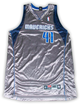
THE WORST: This design, worn only once in 2003 before being taken off the market, are so bad they’ve become almost legendary. It’s easy to understand why; they look like what you’d get if you just wrapped a human in tin foil and said, “OK, now, go play some basketball.” I’m literally sweating while I look at these things because I imagine the players were actually being cooked alive while wearing these on the court.
Dallas Cowboys
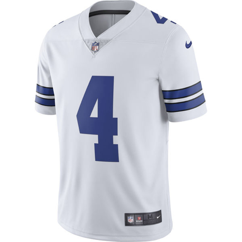
THE BEST: For all the issues one may have with Jerry Jones and the way he runs his team, you can’t accuse him of missing the mark much on the branding front. The Cowboys have a classic look, and they rarely stray from it. A lot of this stems from how simple the team logo is, and how that logo fits into the simple design of the jersey. I mean, it’s just a star! And because it’s just a star, you can package it almost any way you want, in any combination of the team’s silver or blue or even white color schemes, and call it a day. This is a look that just screams, “Don’t mess with success!”
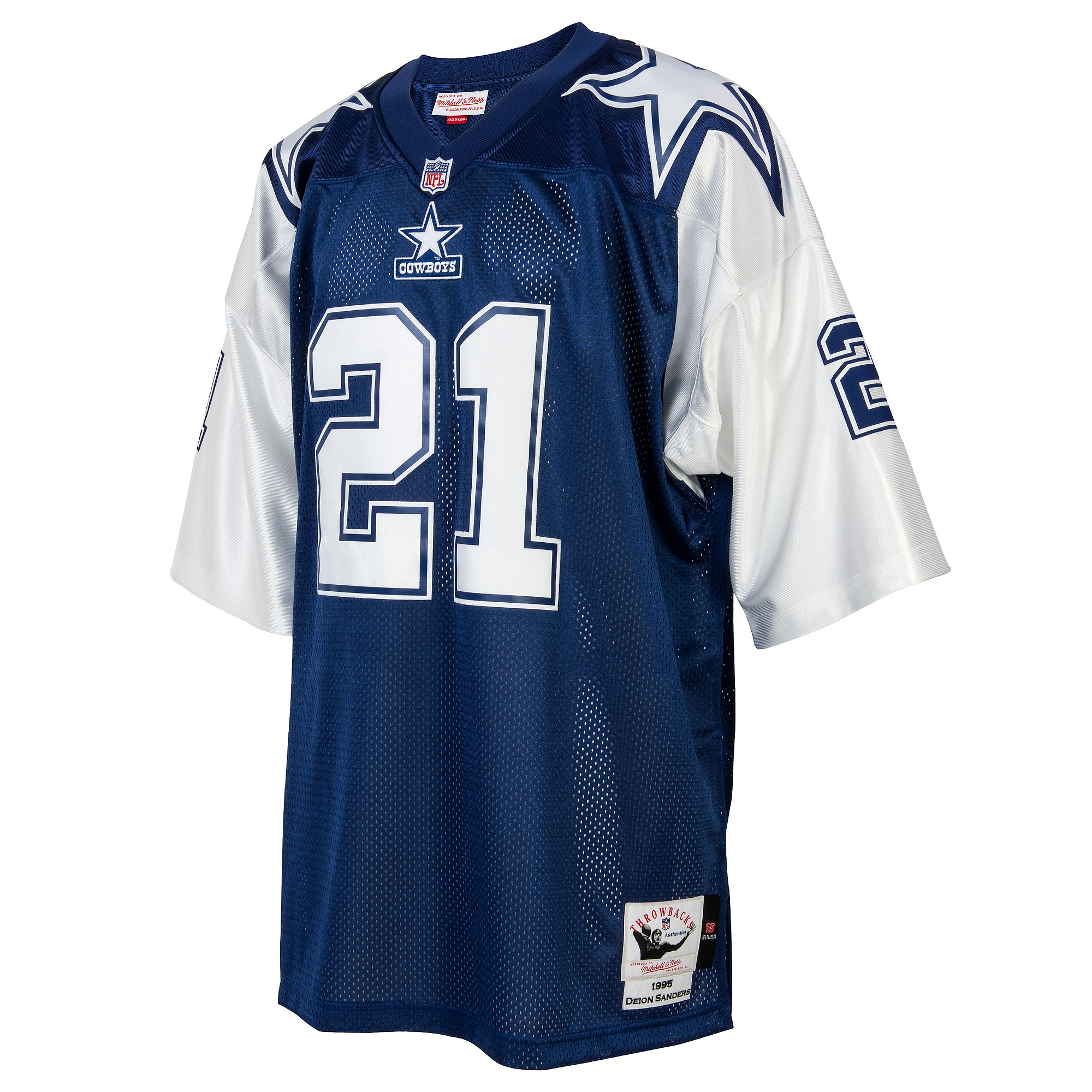
THE WORST: OK, so, this is the exception to the just-slap-a-star-anywhere-and-you’re-good-to-go rule. When you make the star white and putting it right on the shoulder, it looks more like a theatrical production’s interpretation of military attire than it does something that looks sleek on the football field.
Texas Rangers
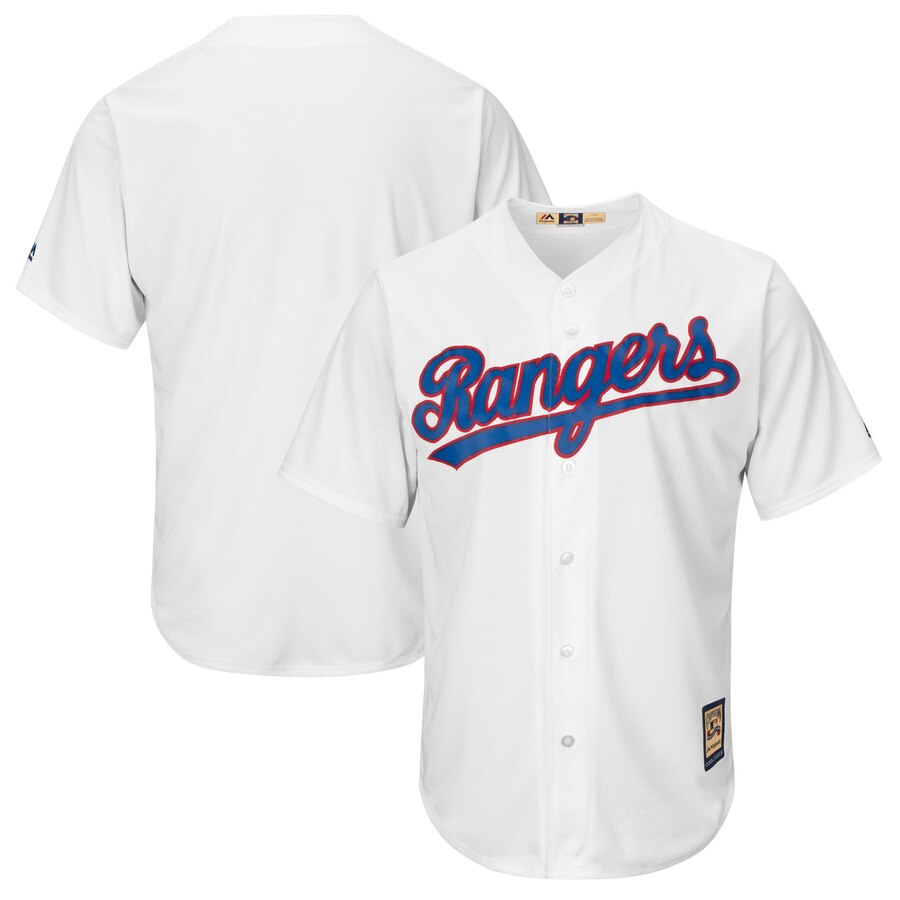
THE BEST: Most plain white jerseys are pretty boring, granted. But the simplicity of this Nolan Ryan-era Rangers look really works in its favor. With the team name scripted out in that classic baseball font where the last letter swoops back under all the other ones, this jersey looks crisp and timeless.
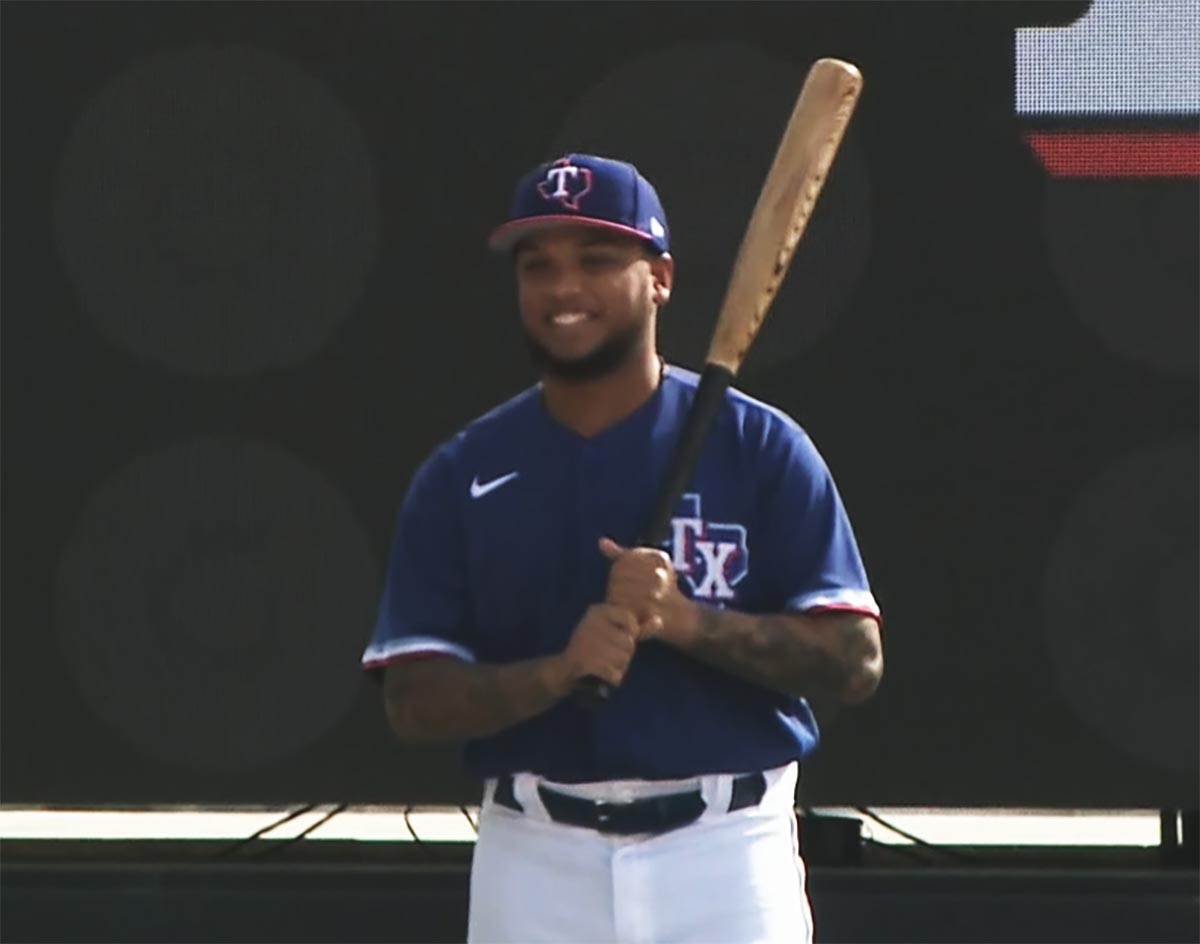
THE WORST: The Rangers just recently announced a slate of new uniform options for the 2020 season and, while most of them are pretty cool, the team’s planned spring training look leaves a lot to be desired. Am I nuts in thinking that it looks like a Polo shirt that’s missing its collar? The modernized version of the old State of Texas logo that’s placed on the left chest just screams golf shirt to me. It’s a very “I’m going to find this at T.J. Maxx one day” kind of jersey — and, even looked at in greater detail, it doesn’t improve much.
Dallas Stars
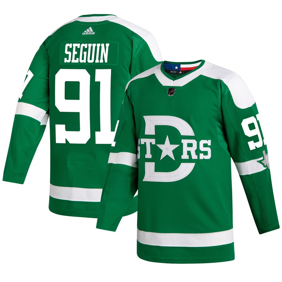
THE BEST: The newest Stars jersey is also the team’s best. Designed for the upcoming Winter Classic match-up that the team is hosting at the Cotton Bowl here in Dallas on New Year’s Day, this design is a clever nod to the uniforms worn by the first pro hockey team in Dallas history, but in the modern team’s Victory Green and white color palette. Another stellar design that errs on the side of simplicity over complication, it even incorporates a little flash into its package in interesting ways, like with how it hides the Texas state flag within its inside back collar. Sure, maybe using a star to stand in for the “A” in “Stars” is a little cliche at this point — but at least the letter and the symbol used to stand in for it both have points at the top — unlike some other examples of letter-swapping that you can find in bad designs elsewhere.
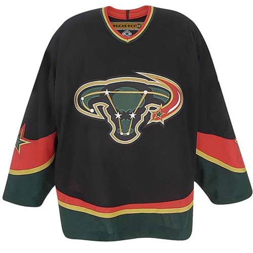
THE WORST: Oh. Oh, no. I’m not even sure what to say about this one. This 2003-2006 alternate sweater design looks like if you took the Chicago Bulls logo and pointed the horns down, then transported this poor bovine creature into space and converted it into a constellation through some kind of dark magic. It’s also popularly referred to as the “Mooterus” jersey, since it bears a bizarre resemblance to the shape of a uterus. Beyond those critiques, the curved lines and shooting star added onto this package fail to contribute anything positive to the mix. This is just a terrible miss on all levels.
Dallas Wings
THE BEST: N/A.
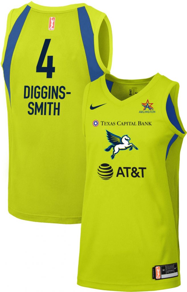
THE WORST: This isn’t necessarily the Wings’ fault, as the WNBA forces all teams in its league to use the same basic design template, swapping out only the colors and logo in order to fit each team’s aesthetic. The Wings’ color scheme is actually pretty interesting and undeniably eye-grabbing, and could be put to use in cool ways by the team if it had the freedom to explore that. Alas, they don’t, and the WNBA’s template doesn’t do the team’s look any favors, leaving its players to look like walking highlighters.
FC Dallas
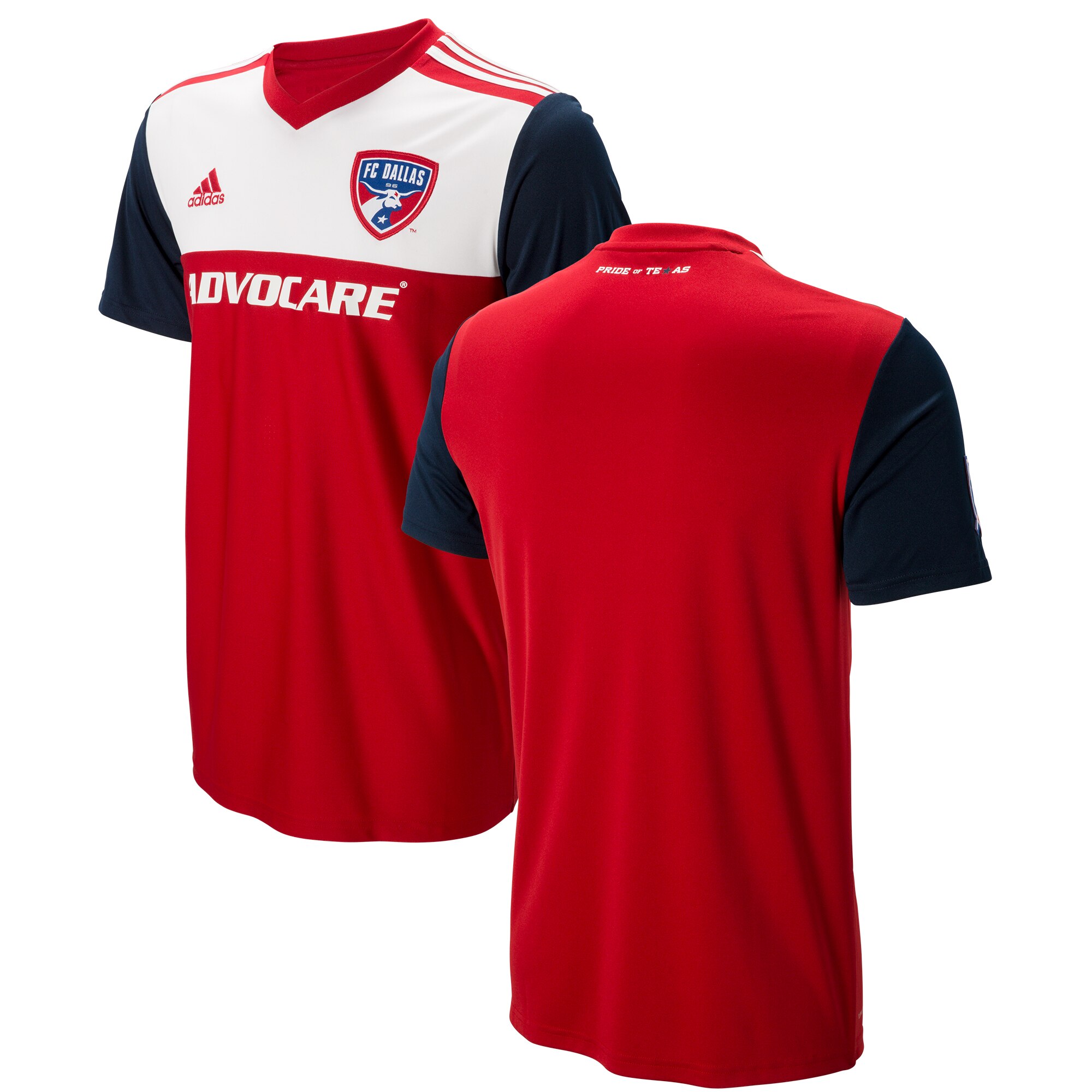
THE BEST: (To be clear, we’re sticking to post-Dallas Burn-era jerseys here.) Considering just how steeped in tradition and pride the State of Texas is — sometimes a good thing, sometimes not a good thing — it’s a little surprising that more area teams don’t rock jerseys that have been inspired by the state flag. But FC Dallas did just that with this kit, and it makes for a clean look — one that manages to be pure Texas without screaming about being pure Texas.
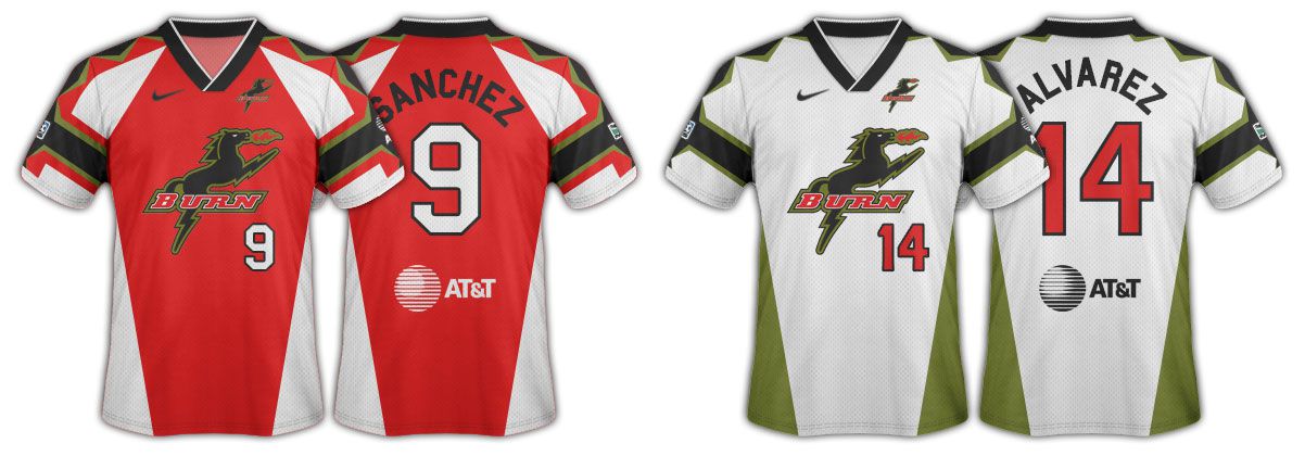
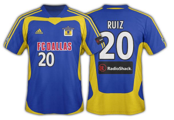
THE WORST: Woof. It’s always a risky endeavor when a team comes out with an alternate jersey that uses a color scheme different than its usual look, but it’s worst when it’s done in tribute to another team, as was the case with this 2006 look that supposed paid homage to Mexico’s famed Tigres club. I’m sure someone in the marketing department thought this would be a good way to endear FC Dallas to the fanbase of a more historic franchise than its own, but the execution here is just an eyesore.
Local Colleges
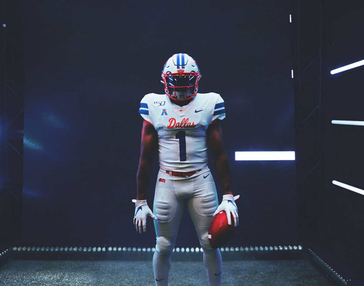
THE BEST: An easy choice, frankly. SMU’s Triple D marketing campaign and subsequent Dallas-themed jersey from this year has been universally praised as a perfect ode to the City of Dallas and maybe the best branding decision that a local sports team has made in a long time. Is it a coincidence that the team that got to wore unis this clean was also the best one that the school fielded in literal decades? We think not.
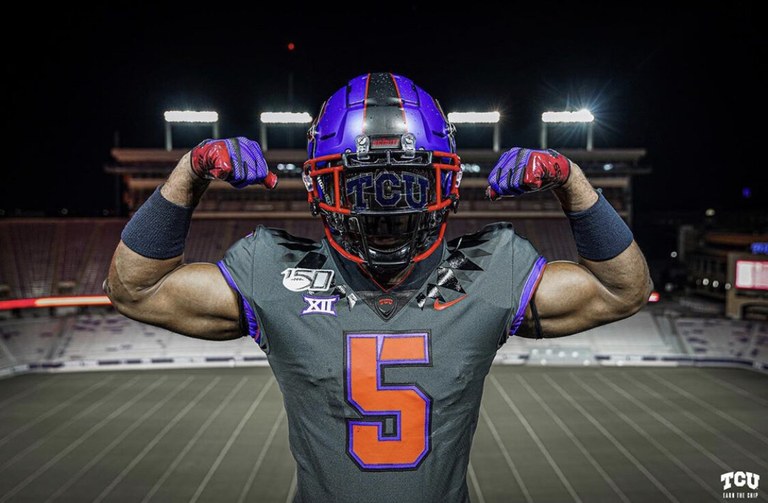
THE WORST: Can someone explain to us why TCU had orange numbers on its alternate uniform this year? Because the school’s own explanation of this design doesn’t do that for us at all. Apparently, this look was inspired by the school mascot’s ability to shoot blood from its eyes as a sort of final defense mechanism when facing down a predator — which, OK, maybe explains the red on the gloves and on the helmet. But why orange on the jersey, then? If I saw someone wearing this around town, I’d immediately think that a Syracuse fan had moved to Dallas. I wouldn’t think, “Oh, orange is kind of like red, which is the color of the blood that horned frogs squirt out of their eyes when they’re worried they might die.” But, hey, maybe that’s just me.