
Dallas City Hall Is Entertaining The Thought Of Killing Off The Triple D Logo. Fuck That.
The buzzword at Wednesday’s city council meeting was “branding.”
As Robert Wilonsky reports over at the Dallas Morning News, the latter part of the meeting focused all on branding talks — and, specifically, about maybe changing our city’s 43-year-old logo.
Not everyone is up for this possibility. City council member Mark Clayton, for instance, is taking an if-it-ain’t-broke-don’t-fix-it stance on Dallas’ logo.
But Dallas City Hall spokesperson, on the other hand, Sana Syed thinks a little branding upgrade could be in order. Her stance is that Dallas “doesn’t have an identifiable brand.”
Never mind that this isn’t particularly true: Dallas’ brand is one inextricably tied to capitalism, dilettantism and luxury. C’mon: It’s why our number one tourist destination is a mall. Dallas’ brand sits right at the intersection of the urbane and the unruly. And smack dab in the middle of that Venn diagram is where you’ll find all of the best Dallas art, music and culture.
That’s certainly true of Dallas’ hip-hop scene and its increasing profile of late.
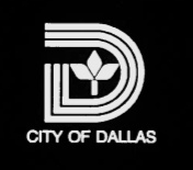
Actually, the hip-hop scene has a legitimate dog in this logo fight, too: The city of Dallas’ logo — the one designed by Crawford Dunn and Associates that we’ve used since 1972 — has actively inspired a large part of Dallas’ hip-hop and black communities. The logo, with it’s three capital Ds, helped create Dallas’ “Triple D” nickname — one that is used both abundantly and excitedly by our city’s artists as a unique identifier.
Here are but a few examples of this terminology in action.
Changing the city’s logo would serve to obliviously smack this whole culture in the face. I’m not exactly expecting city council members to be one hundred percent aware of how important the Dallas logo is to Dallas’ hip-hop community; I’m just saying that it deserves a part of the dialogue when the floor is reopened for more formal discussions on the matter next month.
If the City of Dallas wants to improve its brand, it’s got bigger issues than a new logo. The council should focus on having a good public transportation system, above adequate public schools, beautiful architecture and a whole laundry list of other areas where time and money would be better spent. These are the types of things that make people want to visit and live in world-class cities. So are burgeoning arts and culture scenes, like, say, the rap scene that’s growing right now, right here, in The Triple D.
Also, city logo re-brandings are just dumb to begin with: A little over a year ago, The New Yorker published a piece on Toronto’s efforts toward re-branding itself through its logo.
“It’s not immediately obvious that changing a logo would change the city’s reputation any more than changing a refrigerator’s light bulb changes its ability to keep food cold,” wrote Paul Hiebert in that piece. “And yet, cities persist at changing them.”
And. Yet.
Later, Hiebert adds: “A new logo probably won’t transform a city, in other words, unless it’s part of a package of initiatives to address a city’s challenges.”
Challenges such as public transportation, public schools, art, culture and all the other things I’ve already mentioned above.
Point is, logos are silly. Except when they already mean something to a community like the current one does.
Plus, our logo here at Central Track was inspired by Dallas’ current logo. And what the hell are we gonna do if it’s changed?