
Just For Giggles, We Took Seven Pieces Of Album Art From Recent Local Releases And Rated Them. How Do Your Faves Measure Up?
Being a publication that covers local music, we have seen a lot of cover art in our time. Looking at what local artists choose to represent their songs and albums can be just as fun as listening to the material. That got us thinking, why not make an article of it?
We pulled from artists featured on our recent Valentine’s Day playlists, as well as our list of the top songs of 2021 and chose seven recent releases at random.
Here are our humble two cents on DFW music art and how we rate each respective piece. Who knows, maybe this will be a new thing here.
The Texas Gentleman — Floor It!!!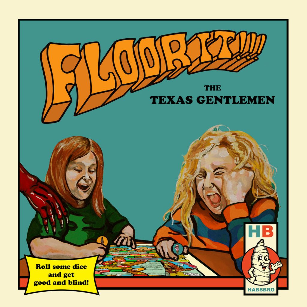
This was painted by Fort Worth artist Matt Cliff, who also did the band’s 2017 album TX Jelly. We’re loving the groovy typography and how the orange of the title pops against the teal background — it’s giving a clear ’70s vibe which is appropriate for the retro board game ad theme. And with a name like Foor It!!!, we appreciate the deviation from the expected car theme. We also stan the devil hand.
The downfall here are the kids because frankly, kids are gross. That being said, Cliff accurately captured the twisted face of a screaming child so props must be given. Personally, a big vinyl sleeve of these kids would have to stay on the shelf.
Rating: 7 out of 10 screaming children.
Cameron Smith — “There Is A Price“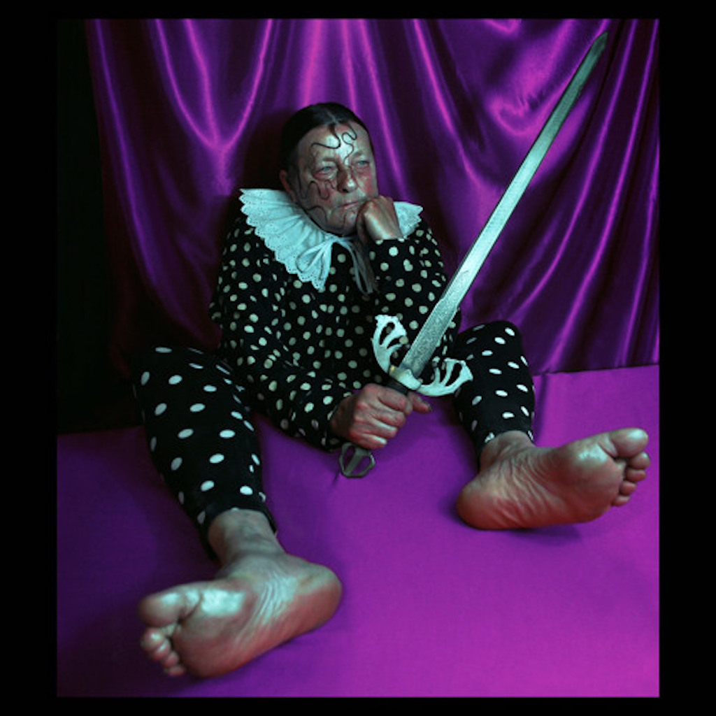
Taken by Polish photographer Marcin Nagraba, this single cover is high art. The colors, the composition, the styling of the subject — it’s all so *chef’s kiss*. (I personally will always have time for slavic culture as well.) On Instagram, Nagraba explains this was his interpretation of the Page of Swords tarot card, using his mother as the model. It’s a stark difference compared to the cover art of Smith’s previous releases, but maybe a dark, Baroque era is on it’s way.
Can’t say we’re feet people, though, so that’ll be a point taken away. If we can put some socks on or angle them differently so that they’re not in our face, that’d be perfect.
Score: 9 out of 10 toes.
Penny Bored — “Trouble”
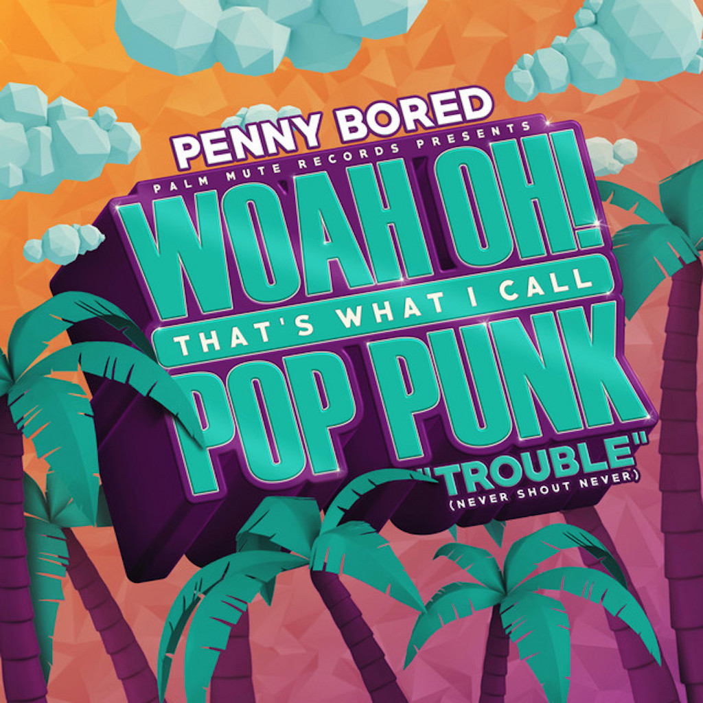
The cover for this collection of pop punk covers put out by local label Palm Mute Records is a clear homage to Now That’s What I Call Music, and we can acknowledge it for what it is — a call to nostalgia. However, this is truly the bootleg version of that. The Now That’s What I Call Music covers weren’t masterpieces, but with their chrome, chunky typography, they had a certain lovable vibe to them. This one just doesn’t hit the same. It tried it’s best to live up to the 2000’s party aesthetic, but it fell flat with the weird geometric patterns that clash with the rest of the design.
This cover is to Y2K as what Stranger Things season 3 is to the ’80s — a generic, unstylish attempt to capture a beloved era. (Sorry Palm Mute Records, that spiciness was mainly aimed at Stranger Things, not you.)
We would’ve preferred a more original concept that screams pop punk, and not one that looks like it belongs in a gift shop at the beach.
Score: 2 out of 5 palm trees.
New Avenues — “Speak Up”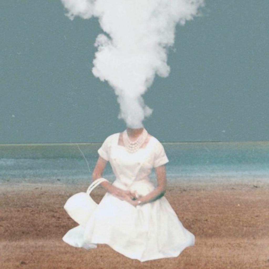
This band’s latest single is sporting a very nice cover and shows that you don’t need a master photographer or graphic designer to deliver a cool concept. New Avenues has continued it’s tradition of using collages for its discography art, which appeals to this writer as collage-making has become a big hobby for her. (Collab?)
It’s clean, simple and delivers a ghostly, chilling aesthetic. It exists in the same universe as something you would spot in an antique store and ask yourself if it’s haunted, and we love that.
Score: 9 out of 10 headless women.
Yella Beezy — “Talk My Shit”

Ok we know we were just praising collages but…
Just because it’s a collage doesn’t make it amazing. Now it’s not like it’s hurting our eyes or anything, but there’s room for improvement. The yellow-green filter over Yella Beezy is suspicious and clashes with the other graphic elements. We’re not sure how this was created, but to us it looks digital, and not made by hand and scanned. The photographs don’t look like actual prints, just digital photos with filters and too-perfect graphics of tears and tape slapped on to make them look like prints. It strived for a hand-made look, but it doesn’t look handmade.
That being said, the concept is really cool and could’ve been tweaked to make everything look more cohesive and fit the (speculated) intended vibe. We also really like the photos.
Score: 5 out of 10 Picsart apps.
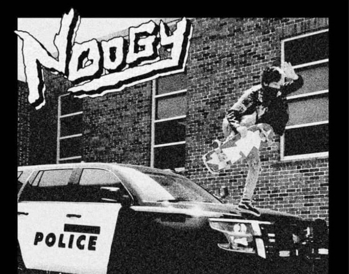
Noogy — Noogy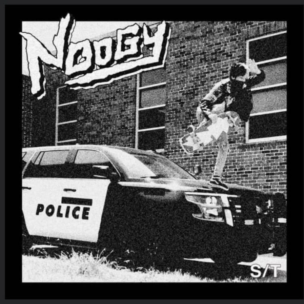
Designed by producer Michael Briggs, Noogy’s self-titled album has a cover that perfectly encapsulates it’s punk sound and anti-police theme of the record. It depicts frontman Andre Vorhis and according to him, he almost went to jail for taking the photo. Now that’s punk.
We love the black and white, the noise, the fact that the photo is of Noogy’s own and the really sweet font.
Score: 10 out of 10 pigs.
Justin King — POST SUMMER DAZE
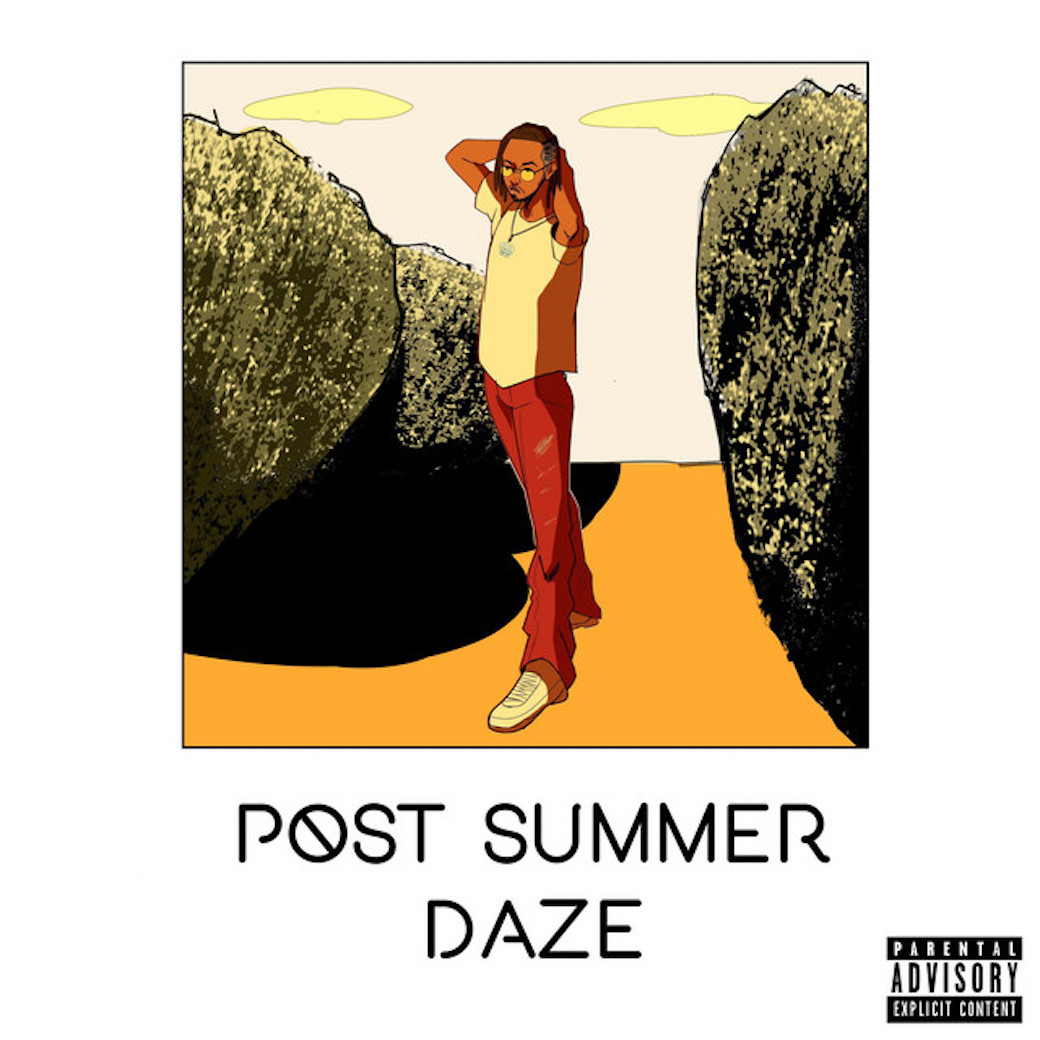
We can’t find the artist credit for this drawing, but it’s cute. King already has cartoon drawings for Dreams And Things and his single “KICKBACK“, but this one is our favorite of the bunch. It’s cleaner, has a more appealing color palette and seems to be inspired by anime styles. It doesn’t blow us away, but it’s a very solid album cover.
The downsides are: for such detail in the rocks, there’s no detail in the sky or sand, so there could be some consistency. Also, when you look at it for a while, the perspective on his arm gets all weird and it looks like he has a weird stump. We’re not artists though, so take this opinion with a grain of salt (or sand.)
Most importantly, why sneakers on at the beach?
Score: 6 out of 10 sandy shoes.