Baroness Frontman and Album Artwork Guru John Baizley Shares His Favorite Album Covers of All Time.
In addition to his role as the frontman for the Savannah, Georgia, sludge metal band Baroness — the second Savannah metal band to play Deep Ellum in as many weeks, interestingly enough — John Baizley has also received significant acclaim for his other gig. And, whether you even realize it, you've probably noticed his work in this realm, too: As a visual artist, his swirling, intricate images have been used as album covers for numerous bands, among them Kvelertak, Flight of the Conchords, Torche and Pig Destroyer.
He does all the artwork for his own band, too, of course. And, tomorrow night, Baroness comes to Trees after rebooting a tour in support of last year's widely acclaimed Yellow & Green — one that was aborted in the wake of the band enduring a harrowing bus crash in England that led to some lineup shuffling and months of physical rehabilitation.
In anticipation of tomorrow night's show, we caught up with Baizley at 10 a.m. this past Tuesday — the earliest interview slot with a musician that one could imagine — to talk about his thoughts on what makes for a great cover, even if he doesn't care for the music. Long story short: While it might seem silly to wax philosophical over Judas Priest and Motorhead album covers, Baizley finds it a worthy endeavor.
“In this day and age, nobody wants to be told what they're seeing; they want to wonder,” Baizley told us. “With album packaging, that's one of the last strongholds of mystery with music and musicians. Because our personalities are now so widely broadcast and so accessible, the art and the actual music are still the last two things that we can hold on to that aren't totally explicit.”
With that in mind, Baizley's was all too happy to indulge us in some further discussion about his favorite album covers of all time.
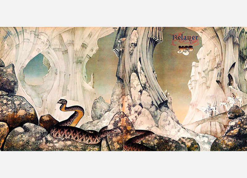
Artist: Yes. “There was an old '70s album cover artist named Roger Dean, who most famously did the Yes album covers. Then he did Budgie, Badger, all the Steve Howe solo albums and all the Asia record covers. The cover he did for the Yes album Relayer was one of those images that I just saw over and over again. I picked the record up at an early age, and I wasn't really impressed by the music nearly as much as I was by the packaging. Across the spectrum of albums that he did there, Dean was definitely one of those guys who imagined his own universe and spread it across everybody else's albums. That impressed me, because it seemed like, here's an artist who isn't necessarily contradicting the music that he's creating images for, but he's got a consistency across his body of work where the artist was definitely in charge of the aesthetic. If you look at all the Yes records and the Asia records, there's a similar style, making them more identifiable oftentimes as his album covers than the records themselves, and I thought that was interesting. A lot of times, there's a heavy amount of art direction involved with a lot of artists, and it makes an odd pairing when you've got a musician who doesn't have a visual sense telling an artist who does what they want on their record.”
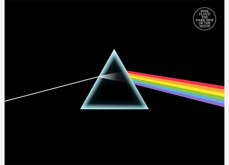
Artist: Pink Floyd. “This is totally obvious, but Dark Side of the Moon. It's one of those rare ones that's iconic — it's got a sublime sort of beauty to it, it's very modern, and, even today, it would still be considered a very modern-looking album cover. I was always impressed by the depth to which their aesthetic reached, how it extended to the stage, it extended to their music, and it seemed like it was a very, very well thought-out project that wasn't overly heavy-handed. It had layers of meaning, it had pop appeal, but there was an intellectualization that appealed to me from a young age. I'd see the album covers and just wonder what was going on. Visually, it sums up the record, it reflects the outlook of the band, it's something that jumps off of a record store shelf at you, it fulfills all the needs of the good album cover artwork. Outwardly, it is pretty simple, but from a pure standpoint of design, it's incredibly complicated, it's a very difficult feat to pull off something that bold with that comprehensive a meaning. My work, I wouldn't say, is remotely that bold and direct. The stuff that I do tends to be much more laborious. If only I could make images that simple and poignant.”
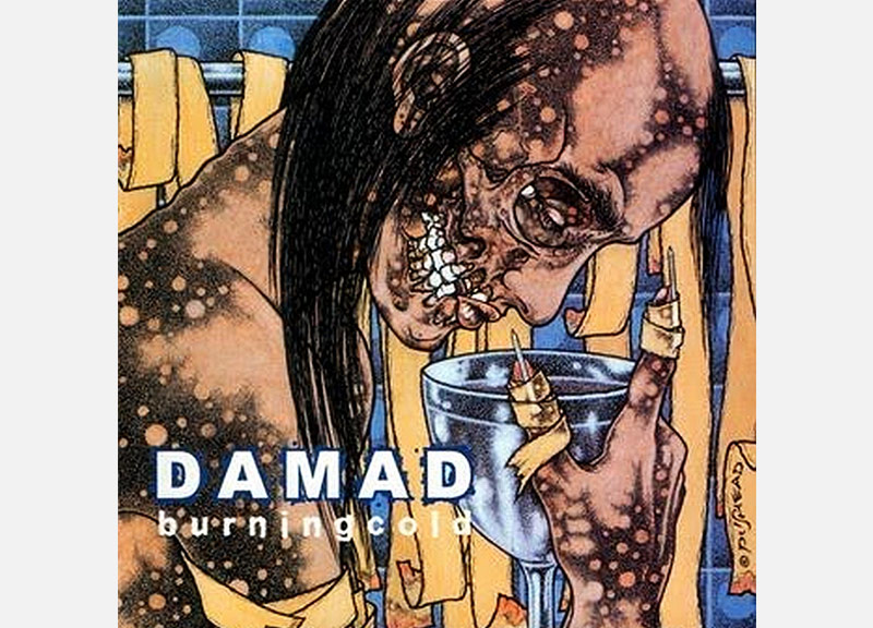
Artist: Damad. “As I got older, Pushead was a huge influence on me, because I was very much interested in and involved in punk rock, and he sort of bridged the gap between punk and metal. When I was in middle school, the cool older kids who knew what they were doing had Metallica shirts on, and Metallica was the only metal band that I listened to for a very, very long time, because I wanted nothing to do with that style of music. But there was sort of that punk rock appeal to it, so, through Metallica, I got into Pushead. And, from that, I got into the deeper, darker, more obscure underground music, to which I would dedicate a very good portion of my life. Visually speaking, his artwork has the appeal for young kids that we, when we're 14 or 15, are sort of angry and angsty and we want something that reflects that. But there's also a very well thought-out sense of layout and dynamics and structure with his work. As a young kid who was interested in punk rock and fine arts, there's a bridge there that he built and allowed me to feel comfortable, ultimately, doing the sort of thing that I did. All the stuff he did for the Savannah band Damad [the predecessor to Kylesa] was great. The Burning Cold album cover, that's one I always cite as a fantastic record cover.”
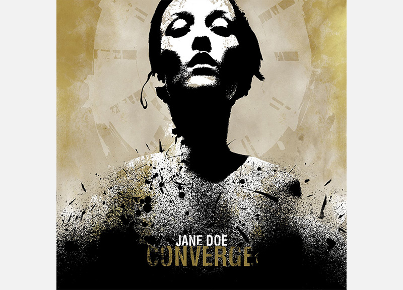
Artist: Converge. “It's Dark Side of the Moon; it's bold and it's simple. It's the 2000-through-now version of the Black Flag bars. It's the Misfits crimson ghost skull. It's an image that kids can get behind. It's simple, but it's recognizable. It's a strong image, and it represents the band and what they're about and how they do things. And I think we need that, just like we needed Black Flag in the '80s. I'm not that bold of an artist; my work isn't that simple, so it doesn't necessarily translate like that. But I'm comfortable with that. I recognize that.”
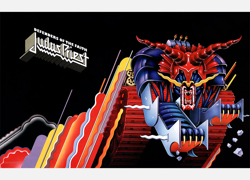
Artist: Judas Priest. “My favorite Judas Priest cover is totally a split between Defenders of the Faith and Screaming for Vengeance. Doug Johnson — awesome, awesome art. I love those images. Priest themselves were so over-the-top and had such a flair for the dramatic and theatrical that of course that's what their album covers looked like. You want to give the audience a clue as to what they're going to listen to, but you don't want to give it all away. You want people to wonder why you've chosen the image, and then you want them to work on that through the lyrics, through the music, through the shows, through the tours and all that stuff.”
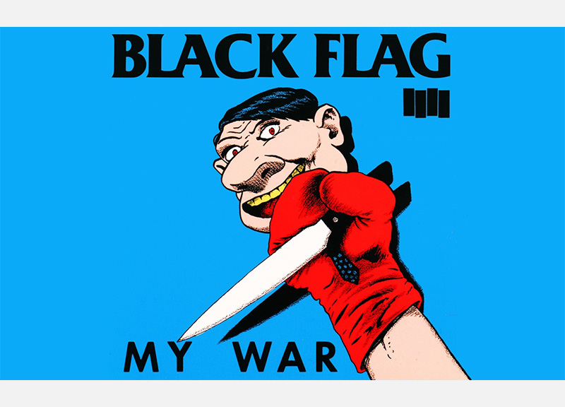
Artist: Black Flag. “My War> is one of my favorites. That's a total, total favorite. The record is incredible, the artwork is incredible, it's totally unique. It doesn't even seem like it should work. But that's a home run, a grand slam of an album cover. It's really quite shocking, isn't it? I love it. There's this wonderful vagueness happening, but you know you're in for a treat. You know you're in for something challenging.”
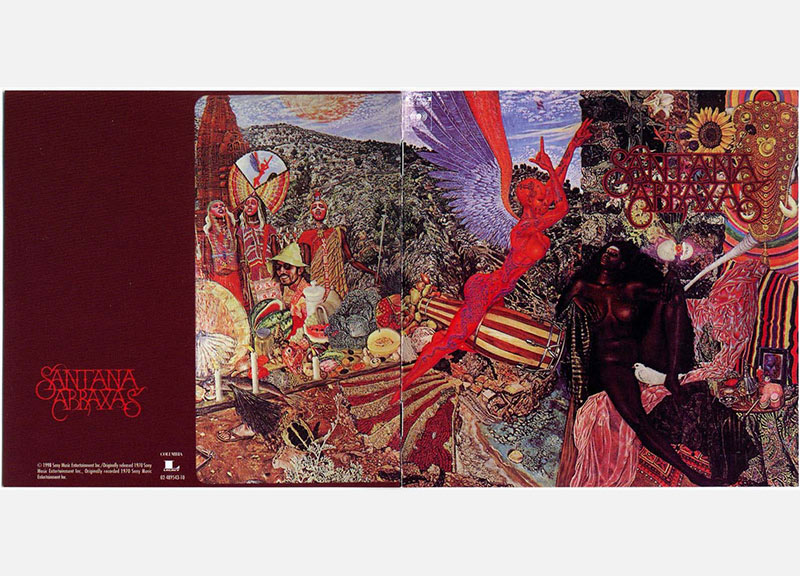
Artist: Santana. “What an amazingly over-the-top, beautiful, thorough, comprehensive album cover. And then, eh, the music is OK. Whatever, it's Santana. Yeah, I get it. You play guitar. But, however, the same artist, Mati Klarwein, did Bitches Brew. That's where it works.”
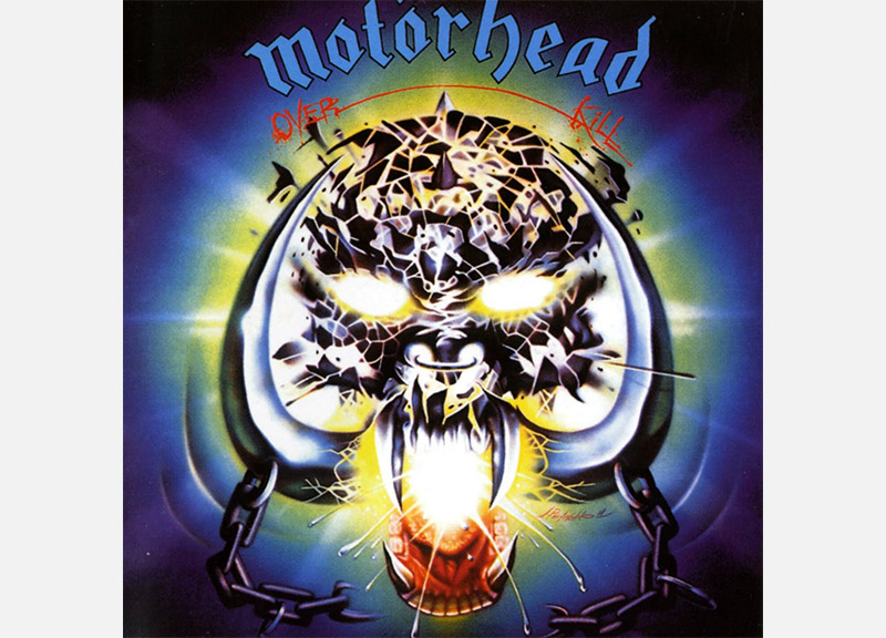
Artist: Motorhead. “That neon, the extreme blues and greens and electricity. That whole record is just dialed to 11 the whole time. The fact that it's called Overkill, that the song “Overkill” has that ending on it, and it just doesn't let up — it doesn't let up — it's the most rock 'n' roll, electric thing you've ever heard. When I think about Motorhead, I always think about that album cover in particular because it's so bright and so memorable.”
Baroness cover photo by Doug Seymour.
Album: Relayer.
Visual Artist: Roger Dean.
Album: Dark Side of the Moon.
Visual Artist: Storm Thorgerson.
Album: Burning Cold.
Visual Artist: Pushead (a.k.a. Brian Schroeder).
Album: Jane Doe.
Visual Artist: Jacob Bannon.
Album: Defenders of the Faith.
Visual Artist: Doug Johnson.
Album: My War.
Visual Artist: Raymond Pettibon (a.k.a. Raymond Ginn).
Album: Abraxas.
Visual Artist: Mati Klarwein.
Album: Overkill.
Visual Artist: Joe Petagno.